


The Ultimate Guide to Business Data Visualization: Unlocking Insights for Success
In the world of business, data visualization has become a crucial tool for understanding complex data and making informed decisions. With the rapid increase in data availability, businesses are now leveraging data visualization to simplify decision-making, enhance business performance, and foster growth. This guide will explore how data visualization works, why it’s important, and how you can use it to improve your business strategies.
What is Data Visualization?
Data visualization refers to the graphical representation of information and data. By using charts, graphs, and other visual tools, complex data sets become easier to understand, analyze, and interpret. Visualizations allow businesses to identify trends, patterns, and insights more quickly than by looking at raw data alone.
Why is Data Visualization Important for Businesses?
Data visualization simplifies the communication of complex data, making it more accessible to business owners, managers, and decision-makers. The human brain processes visuals much faster than text, which is why data visualizations are so effective.
-
Improves Decision-Making: By visualizing data, businesses can make quicker, more accurate decisions based on real-time information.
-
Enhances Understanding: Complex datasets are often difficult to interpret in raw form. Visualization transforms data into easy-to-understand formats, making it easier to spot trends and correlations.
-
Fosters Better Collaboration: Teams can share insights more effectively, leading to collaborative problem-solving and innovation.
-
Increases Efficiency: Visual tools help quickly pinpoint areas for improvement or investment, which increases operational efficiency.
Types of Business Data Visualizations
Business data can be represented in various ways, depending on the type of information and the insights you want to derive. Here are some common types of data visualizations used in businesses today:
1. Bar and Column Charts
Bar and column charts are widely used in business data visualization to compare different categories. They are ideal for showing the size of items in a group and are often used to display sales performance, product comparisons, or customer demographics.
-
Best for: Comparing multiple categories of data side by side.
-
Example: Comparing sales performance across different regions.
2. Pie Charts
Pie charts are used to show percentage breakdowns of a whole. They are best used when you want to show the relative proportions of different categories that make up a total.
-
Best for: Showing proportions or market share.
-
Example: Distribution of market share across competitors.
3. Line Graphs
Line graphs are ideal for showing data trends over time. They are especially useful when analyzing time-series data, such as monthly revenue or website traffic.
-
Best for: Tracking trends over a specific period.
-
Example: Showing the growth of customer base over several months.
4. Heatmaps
Heatmaps are a great way to visualize data where values are represented by color intensity. They are often used to track website engagement or sales performance by region.
-
Best for: Visualizing large sets of data with varying values.
-
Example: Tracking website user behavior or sales by region.
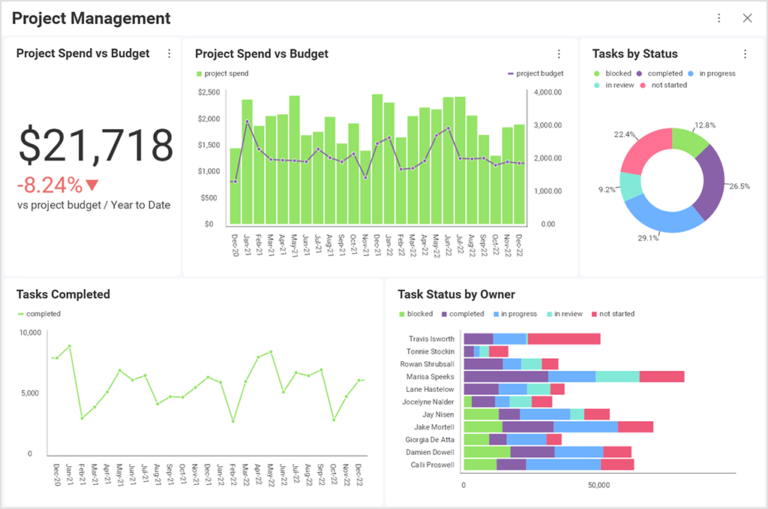
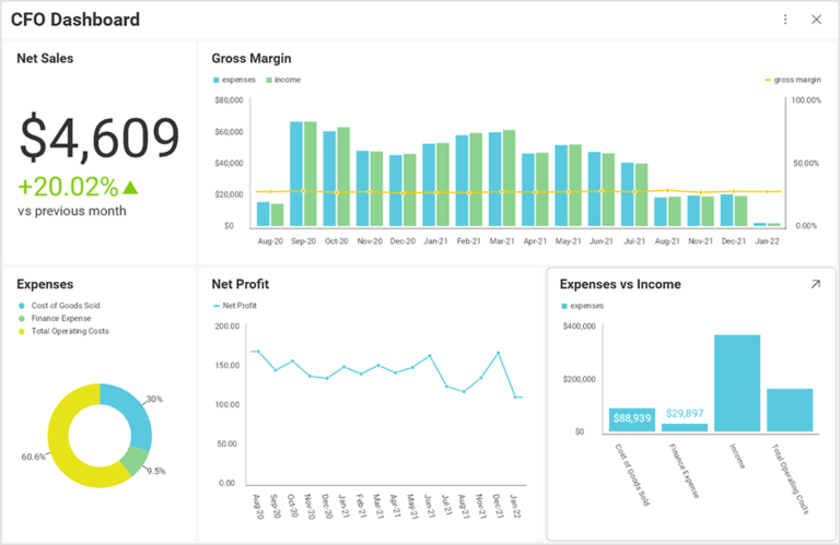
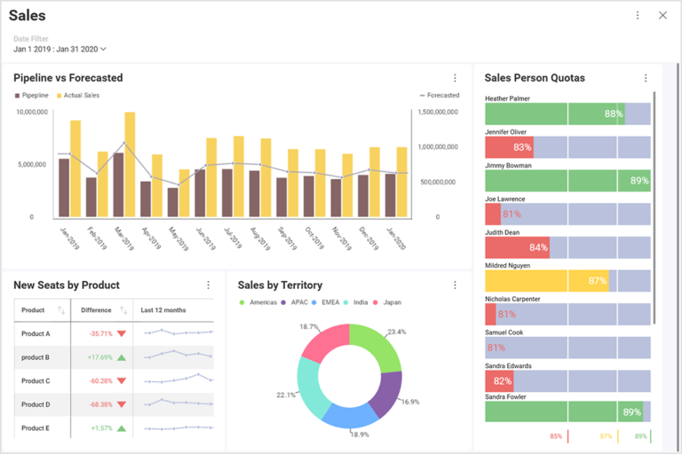
5. Dashboards
Dashboards compile multiple visualizations into a single view, giving a comprehensive overview of various business metrics. Dashboards often include graphs, charts, and other visual tools to monitor performance indicators.
-
Best for: Quick overviews of key metrics and KPIs.
-
Example: A sales dashboard showing revenue, conversions, and customer acquisition metrics.
How to Use Data Visualization in Your Business
Once you understand the types of data visualizations, it’s important to know how to apply them to your business. Effective data visualization requires the right tools, strategies, and a focus on your business goals.
1. Identify Key Metrics and KPIs
Before you can visualize data, it’s crucial to identify the key metrics or KPIs (Key Performance Indicators) that drive your business. Whether it’s sales figures, customer satisfaction, or website traffic, knowing what to measure is the first step.
-
Example: For an e-commerce business, you might focus on metrics like conversion rates, average order value, and customer retention.
2. Select the Right Tools
Choosing the right data visualization tools is essential for creating effective visualizations. There are many tools available, from simple spreadsheet software to advanced business intelligence platforms.
-
Popular Tools:
-
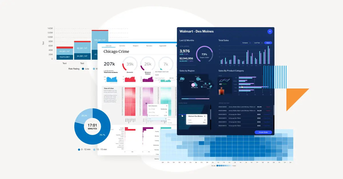
Slingshot: A powerful platform that integrates data from various sources to provide real-time insights. It includes tools for project management, finance, and sales data visualization.
-
Tableau: Known for its interactive dashboards and ability to handle large datasets.
-
Power BI: A Microsoft tool for creating custom visualizations from multiple data sources.
-
3. Integrate Your Data
For effective data visualization, you need to ensure that all your data sources are integrated into a unified platform. This helps in analyzing data holistically and ensures that your visualizations are based on up-to-date information.
-
Example: Use tools like Slingshot to pull data from CRM systems, marketing platforms, and financial tools for comprehensive analysis.
4. Create Visualizations that Tell a Story
Good data visualizations should not just present numbers, but should tell a story. A well-designed visualization helps your audience understand what the data means and how it impacts decision-making.
-
Tip: Use a combination of charts, colors, and labels to create a narrative around your data. This makes it easier for stakeholders to understand key insights at a glance.
Benefits of Business Data Visualization
The use of data visualization offers several significant advantages for businesses:
1. Quick Decision Making
Visualizing data in real-time allows decision-makers to act swiftly. By presenting data clearly, data visualizations eliminate the need for lengthy analysis, allowing businesses to react faster to changes in the market.
2. Improved Communication
Data visualizations are an effective way to communicate complex information to non-experts, such as investors, stakeholders, and employees. This leads to better alignment and understanding across teams.
3. Actionable Insights
By highlighting trends, patterns, and outliers, data visualization enables businesses to spot opportunities and challenges quickly. This helps in making more informed, data-driven decisions.
4. Increased Engagement
Interactive data visualizations, such as dashboards, encourage stakeholders to engage with the data, drill down into specific metrics, and ask insightful questions that lead to better business strategies.
Challenges in Business Data Visualization
While data visualization offers several benefits, businesses often face challenges when implementing it:
1. Data Overload
When visualizing large sets of data, businesses can easily become overwhelmed. It’s important to focus on key metrics and avoid cluttering visualizations with unnecessary details.
2. Choosing the Right Visualization
Selecting the right chart or graph is critical for effective communication. A bar chart might be ideal for some data sets, while a line graph might be better suited for others. Understanding the data and audience is crucial.
3. Data Quality
The accuracy of your visualizations depends on the quality of the data. Inaccurate or outdated data can lead to misleading visualizations, which can ultimately harm business decisions.
FAQs About Business Data Visualization
Q1: How does data visualization benefit my business?
Data visualization helps businesses make better decisions, improve communication, and identify trends and opportunities faster. It provides a clearer understanding of complex data, leading to more informed choices.
Q2: What is the best tool for creating business data visualizations?
Some of the best tools for business data visualization include Slingshot, Tableau, and Power BI. These platforms offer a range of features for integrating data, creating visualizations, and providing real-time insights.
Q3: How often should I update my data visualizations?
It’s important to keep your visualizations up-to-date with real-time data to ensure accuracy. For ongoing projects, updating visualizations daily or weekly might be necessary to maintain relevant insights.
Q4: Can data visualization help with financial analysis?
Yes, financial data visualization is crucial for tracking key financial metrics, such as cash flow, revenue growth, and expenses. Visual tools can help business owners better understand their financial health and make smarter investment decisions.
Conclusion
Data visualization is no longer a luxury for businesses; it’s a necessity. By simplifying complex data into clear, visual formats, businesses can make more informed decisions, improve communication, and drive growth. Whether you’re tracking sales performance, monitoring marketing campaigns, or analyzing financial data, visualizing your business data empowers you to act with confidence.


